
White Noise
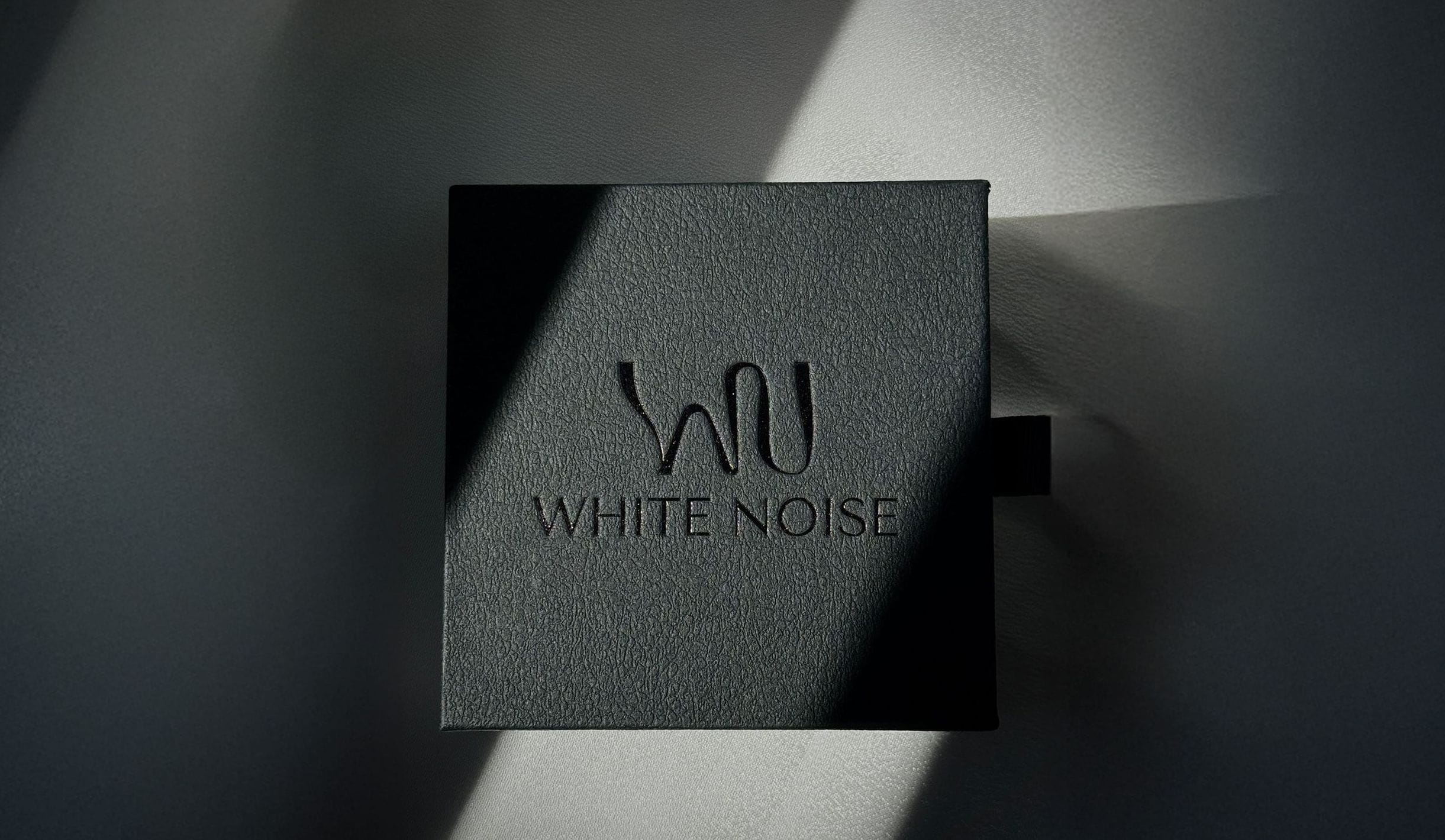
Where minimalism meets personality.
I had the privilege of working with Sara, the founder of White Noise, a brand of minimalist, symbolic jewelry that carries emotions, personal stories, and memories. Her vision was simple yet profound: to create jewelry that is luxurious yet accessible; minimalist yet expressive; personal yet universal.
From the very beginning, this project was never just about designing a logo or picking colors. We wanted White Noise to be a living brand — a story told through every detail, from packaging and social media content to the webshop and the brand's entire communication. My job was to connect all of those elements and help Sara bring her vision to life through a complete brand experience.
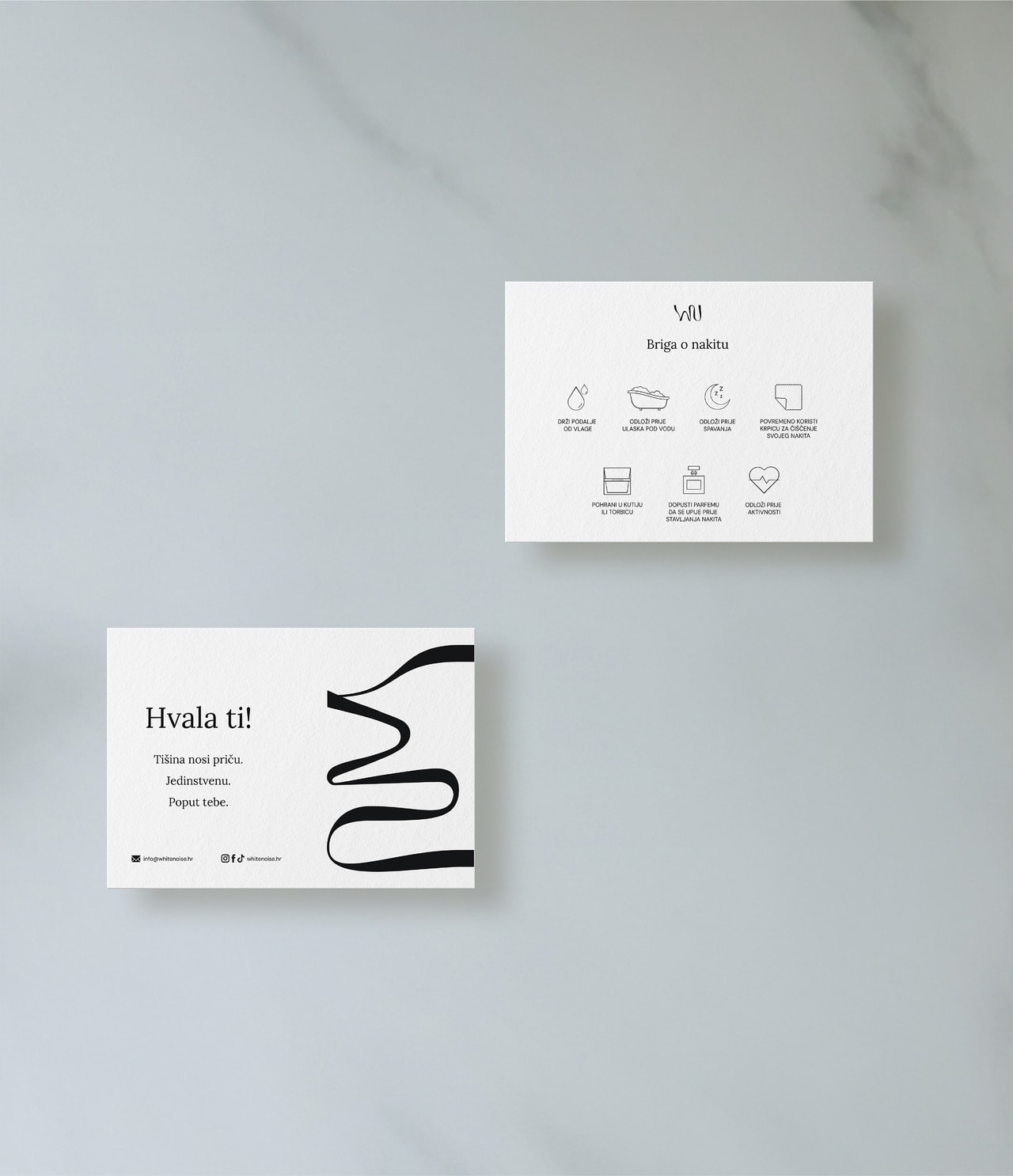
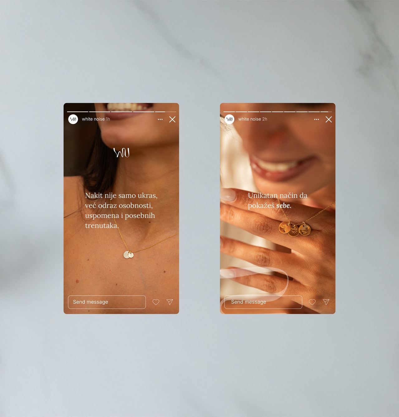
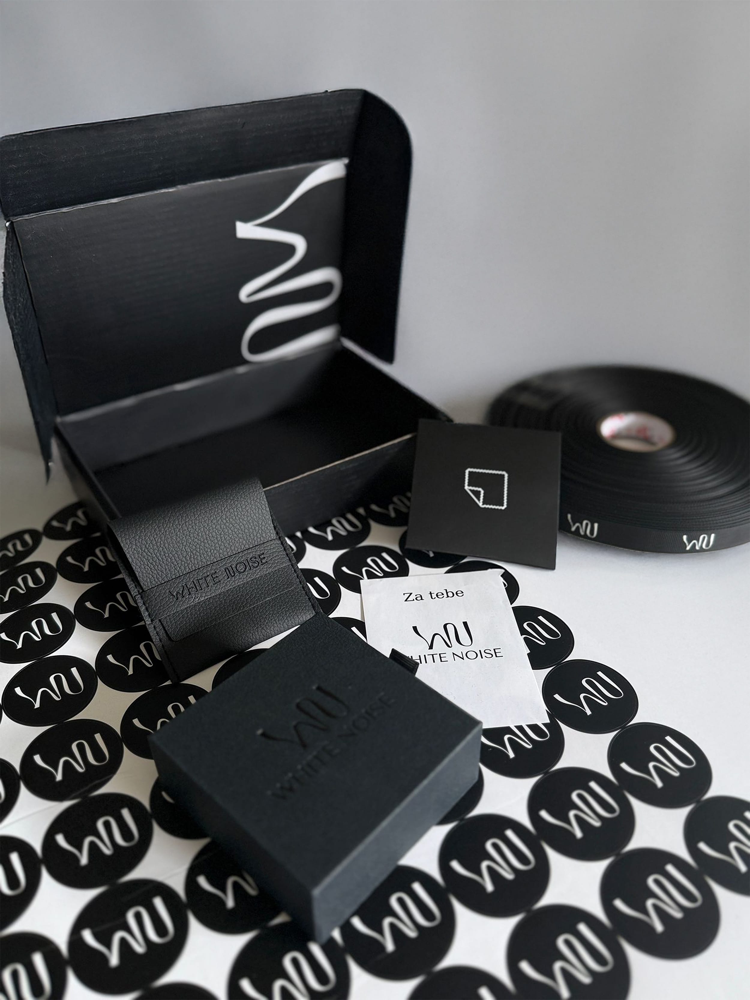
A blend of textures — a black-and-white world that carries not colors, but emotions.
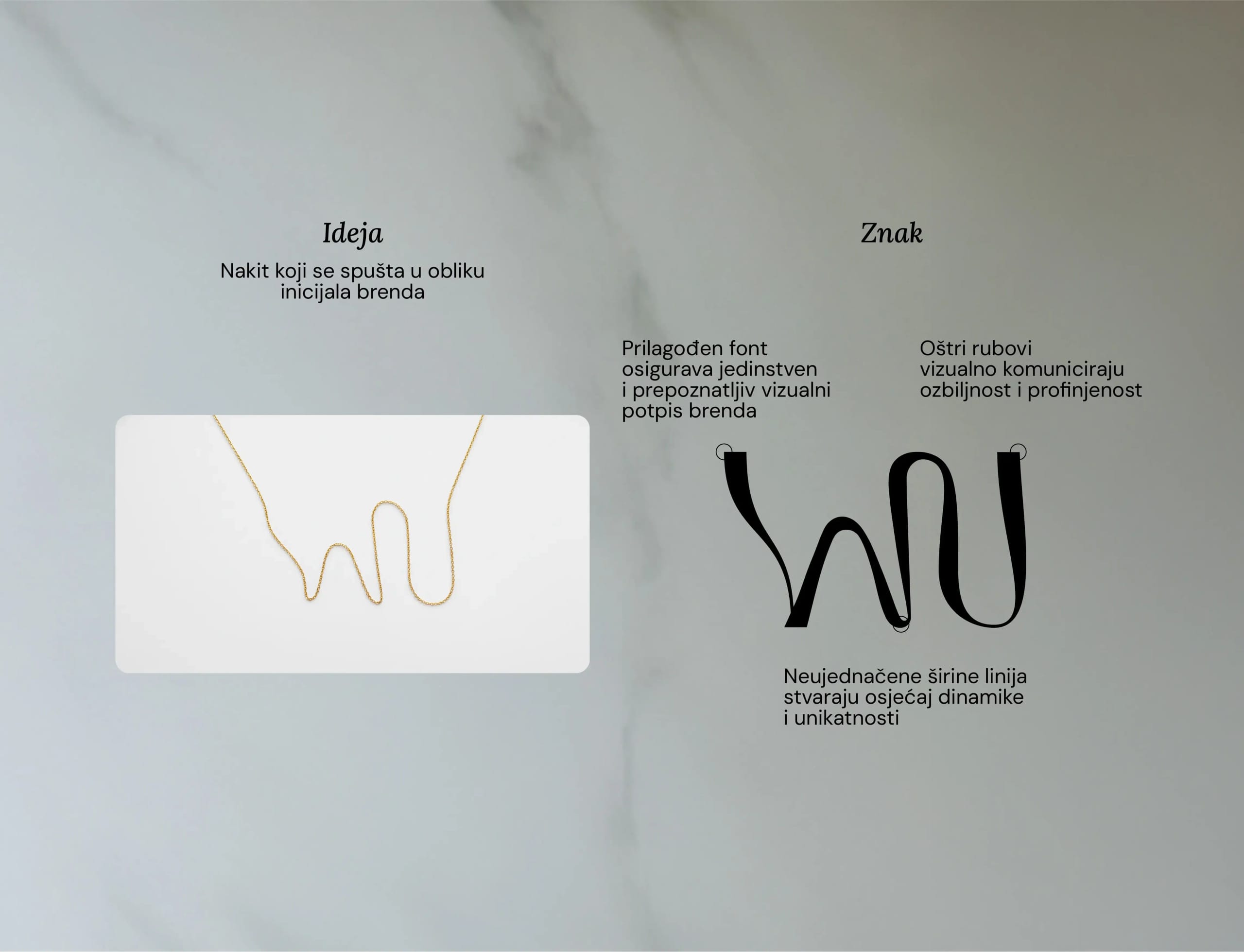
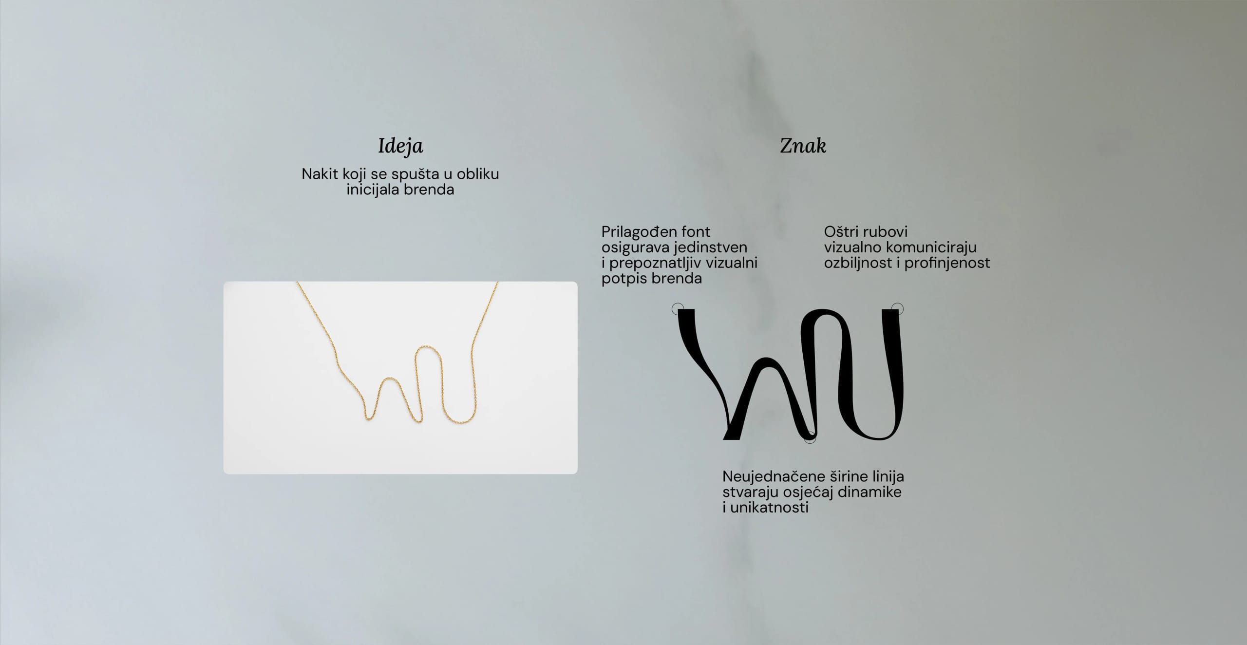
We started with the logo. It needed to be fluid, elegant, and alive — just like the jewelry. The initials W and N are shaped into a single joined mark, a subtle nod to a necklace chain, combining straight, curved, and narrow lines that follow the shape of the body. Simple at first glance, but a closer look reveals layers of meaning — the same attention to personal and symbolic detail carried by every White Noise piece.
I paid special attention to details and proportions so the mark would work across all surfaces — print materials, web, packaging — while keeping its elegance and versatility. Lines of varying weights emphasize uniqueness, while sharp endings add a touch of refinement, positioning White Noise as a premium brand without ever feeling cold.
The color palette and typography were carefully crafted to reflect the brand's core values: timeless elegance, minimalism with warmth, and subtle femininity. The primary colors convey trust and simplicity, while the secondary ones bring softness for limited collections. The fonts are minimal yet expressive, letting the brand's voice stay recognizable both online and offline.
But the project didn't stop at visuals. I was also involved in shaping the brand's communication — from the Instagram feed strategy and campaign ideas, through packaging design, to the structure of the webshop. Every decision was guided by one principle: create a brand that feels personal, intentional, and unforgettable.
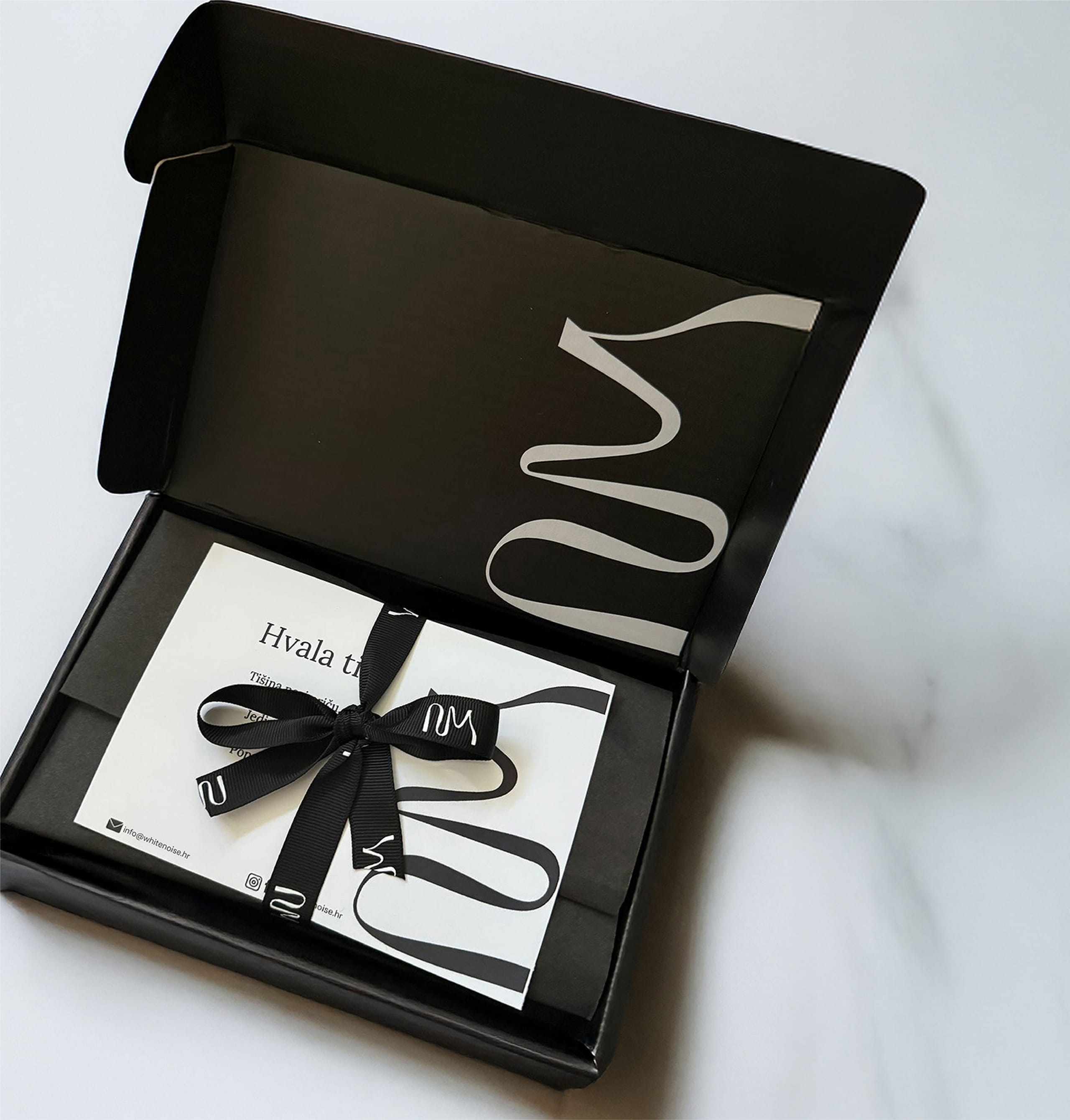
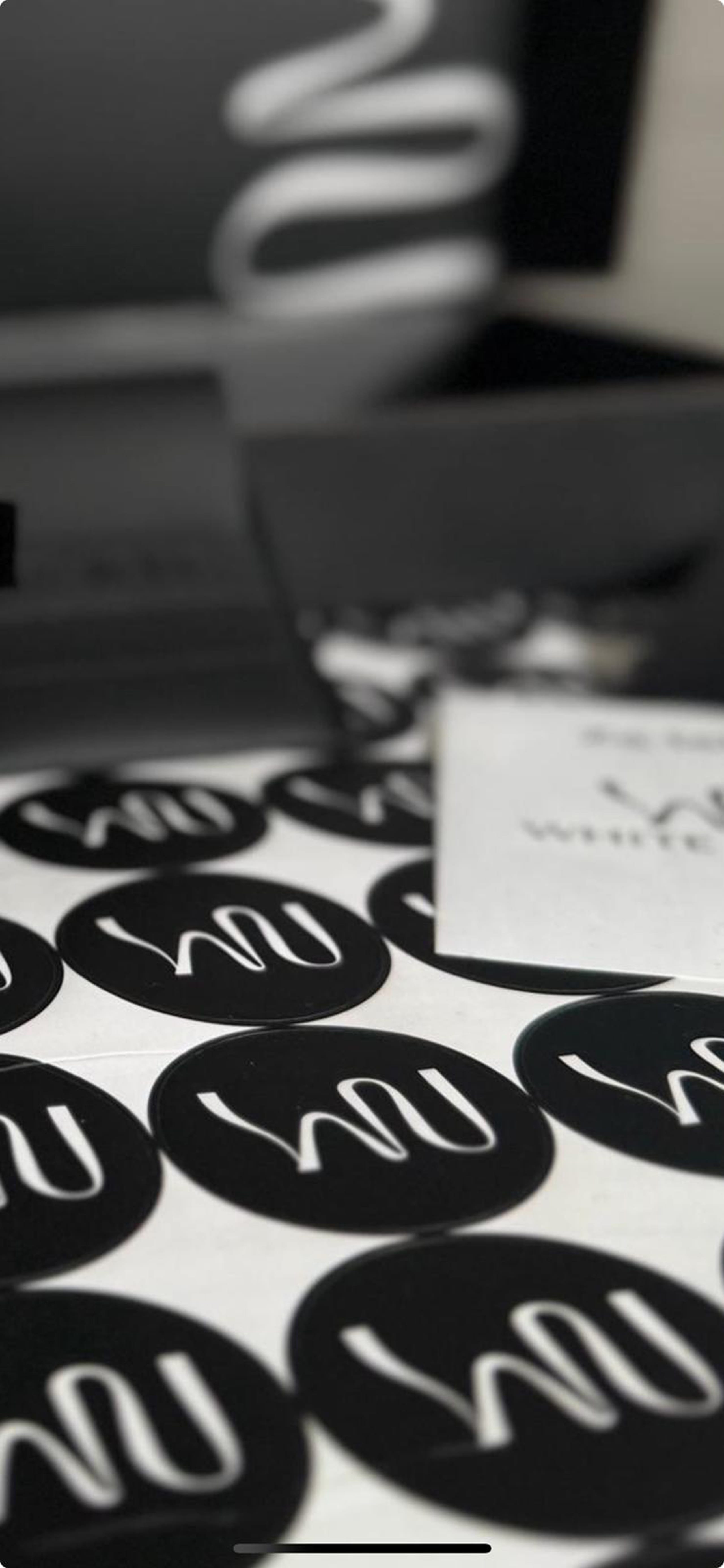
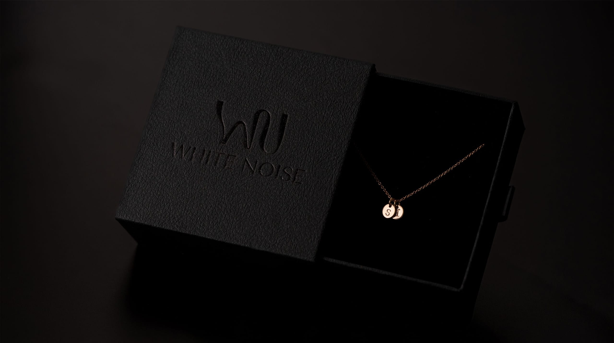
With the packaging, the goal was for every opened package to be an experience. Materials, textures, and finishes were chosen to reflect the same subtle elegance and emotional value as the jewelry itself. Every element — from ribbons to boxes and labels — carries meaning and deepens the intimate bond between the wearer and their piece.
The webshop was designed as a natural extension of the identity — simple, clean, and intuitive, yet detailed enough to show the brand's personality and the stories behind each piece. Every product page, every layout, and every micro-interaction was carefully considered to make the experience feel emotional and elegant.
White Noise is more than a visual identity. It's a brand that lives, breathes, and communicates across every touchpoint. The jewelry tells a story, and the brand makes sure that story is experienced in full — from the first glance at the logo, to the moment the package is opened, to the subtle content on social media.
Working on White Noise was a project of trust and exploration. It was important to create something that doesn't just look beautiful but also makes sense — where every decision is rooted in storytelling, strategy, and emotion. The end result? A brand that is minimalist yet expressive; luxurious yet accessible; modern yet timeless — a true reflection of Sara and the stories her jewelry carries.

 visual identity logo design web design packaging design social media design graphic design visual identity logo design web design packaging design social media design graphic design visual identity logo design web design packaging design social media design graphic design visual identity logo design web design packaging design social media design graphic design visual identity logo design web design packaging design social media design graphic design visual identity logo design web design packaging design social media design graphic design visual identity logo design web design packaging design social media design
  Stories after they said ‘Sí’ Stories after they said ‘Sí’ Stories after they said ‘Sí’ Stories after they said ‘Sí’ Stories after they said ‘Sí’ Stories after they said ‘Sí’ Stories after they said ‘Sí’ Stories after they said ‘Sí’ Stories after they said ‘Sí’ Stories after they said ‘Sí’ Stories after they said ‘Sí’ Stories after they said ‘Sí’ Stories after they said ‘Sí’ Stories after they said ‘Sí’ Stories after they said ‘Sí’ Stories after they said ‘Sí’ Stories after they said ‘Sí’ Stories after they said ‘Sí’ Stories after they said ‘Sí’ Stories after they said ‘Sí’ Stories after they said ‘Sí’ Stories after they said ‘Sí’ Stories after they said ‘Sí’ Stories after they said ‘Sí’ Stories after they said ‘Sí’ Stories after they said ‘Sí’ Stories after they said ‘Sí’ Stories after they said ‘Sí’ Stories after they said ‘Sí’