
Octo
Brand identity for a curated marketplace of handmade products
Handmade objects carry stories, time, and human skill.
Yet online, they're often displayed like any other product in a standard webshop lineup. Octo was created to change that. The founders started the project out of frustration. Despite Croatia's strong handmade scene, there was no single place where carefully selected work could easily be discovered online. There were two extremes: generic souvenir shops, or large marketplaces that treat handmade work like any other merchandise. Octo wanted to create something different — a curated online space where the makers of handmade work and people in search of meaning and carefully crafted objects could finally meet.
Most handmade marketplaces look and function the same.
They lean on familiar visual clichés: earthy palettes, craft symbolism, handwritten lettering, and overly sentimental messaging. At the same time, many platforms apply aggressive e-commerce tactics that reduce handmade work to simple transactions.
In both cases, the result is the same: the real value of handmade work disappears. If Octo followed the same visual and communication patterns, it would become just another webshop in an already crowded space.

Instead of positioning Octo as a shop, the brand needed to function as something more meaningful:
a curator and a connector.
A platform that gathers the work of independent makers and brings it to people who appreciate thoughtful, personal objects. The strategic shift was simple but powerful:
Octo doesn't sell products. Octo presents makers. That meant moving away from the folk aesthetics of traditional crafts and building a contemporary visual identity that treats handmade work with the same respect as art or design pieces. The brand name naturally brought a powerful metaphor: the octopus.
Rather than turning it into a literal mascot, the concept was translated into a visual system inspired by the octopus's hydrostatic structure — a body that moves, adapts, and reaches outward.
This idea became the foundation of the identity. Like an octopus's arms stretching in different directions, the platform brings together the work of different makers and connects it with people searching for something special. The system needed to feel flexible, organic, and alive — just like the process of making things by hand. The visual language was designed to balance two qualities rarely combined in this industry: warmth and sophistication.
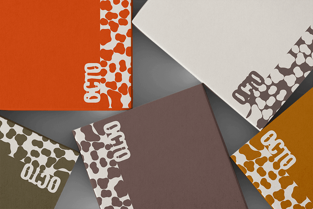
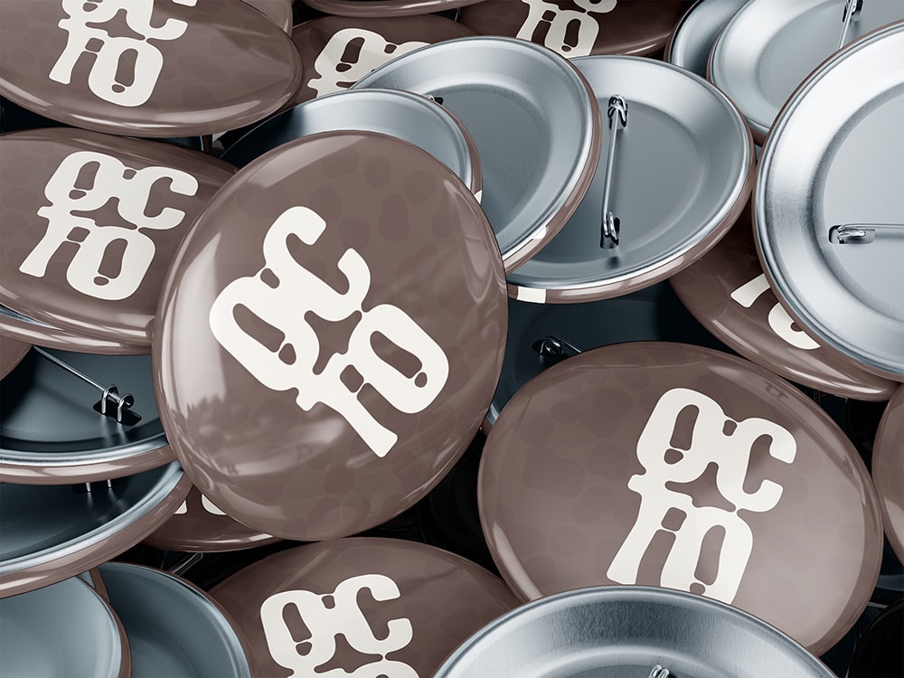
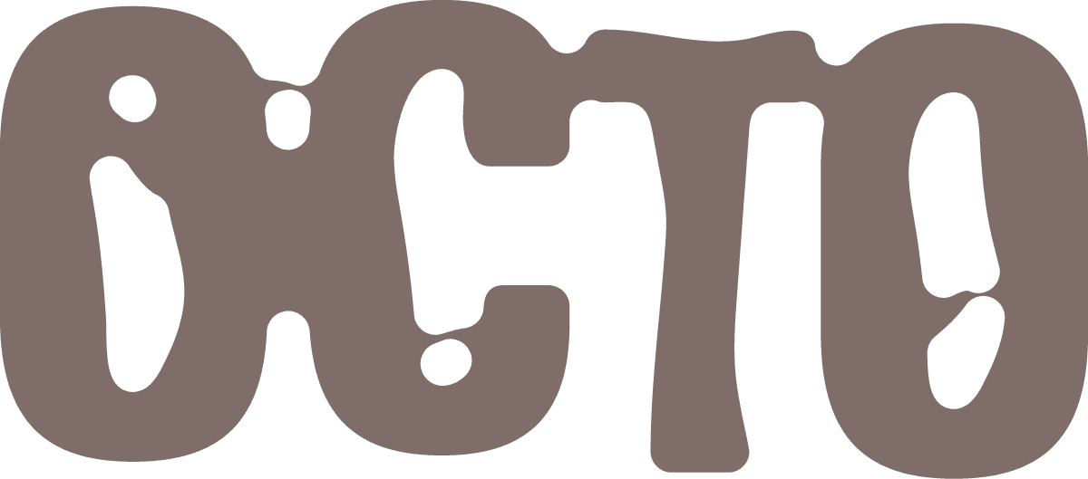
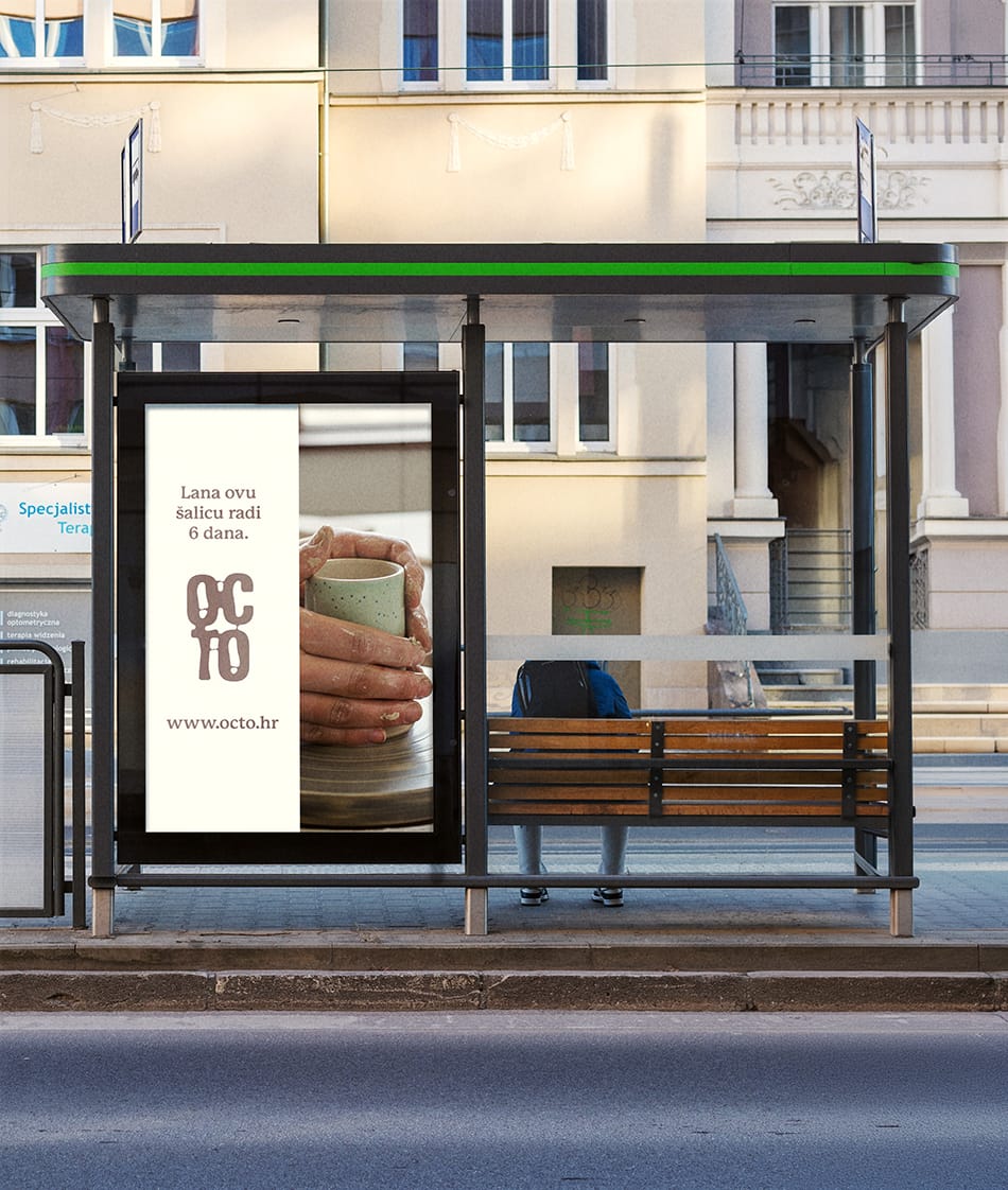
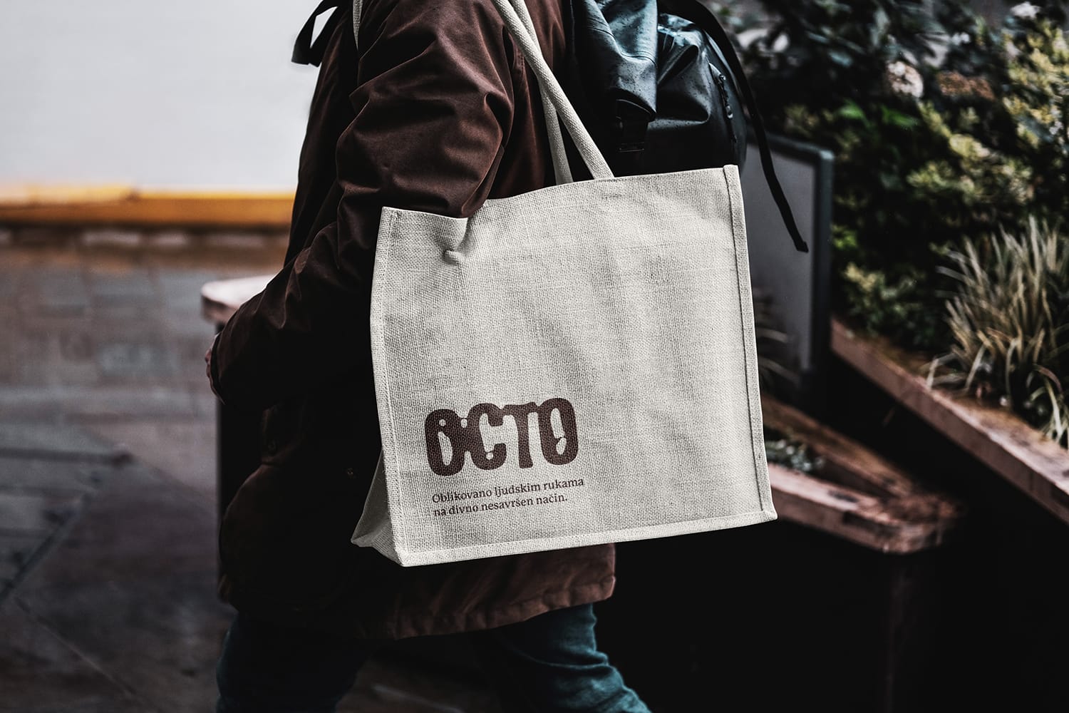
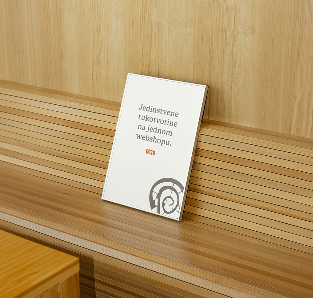
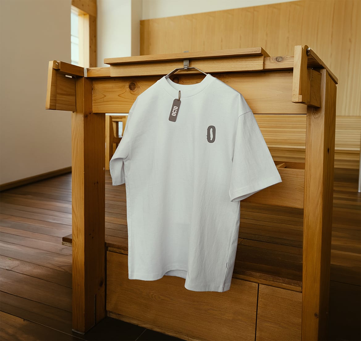
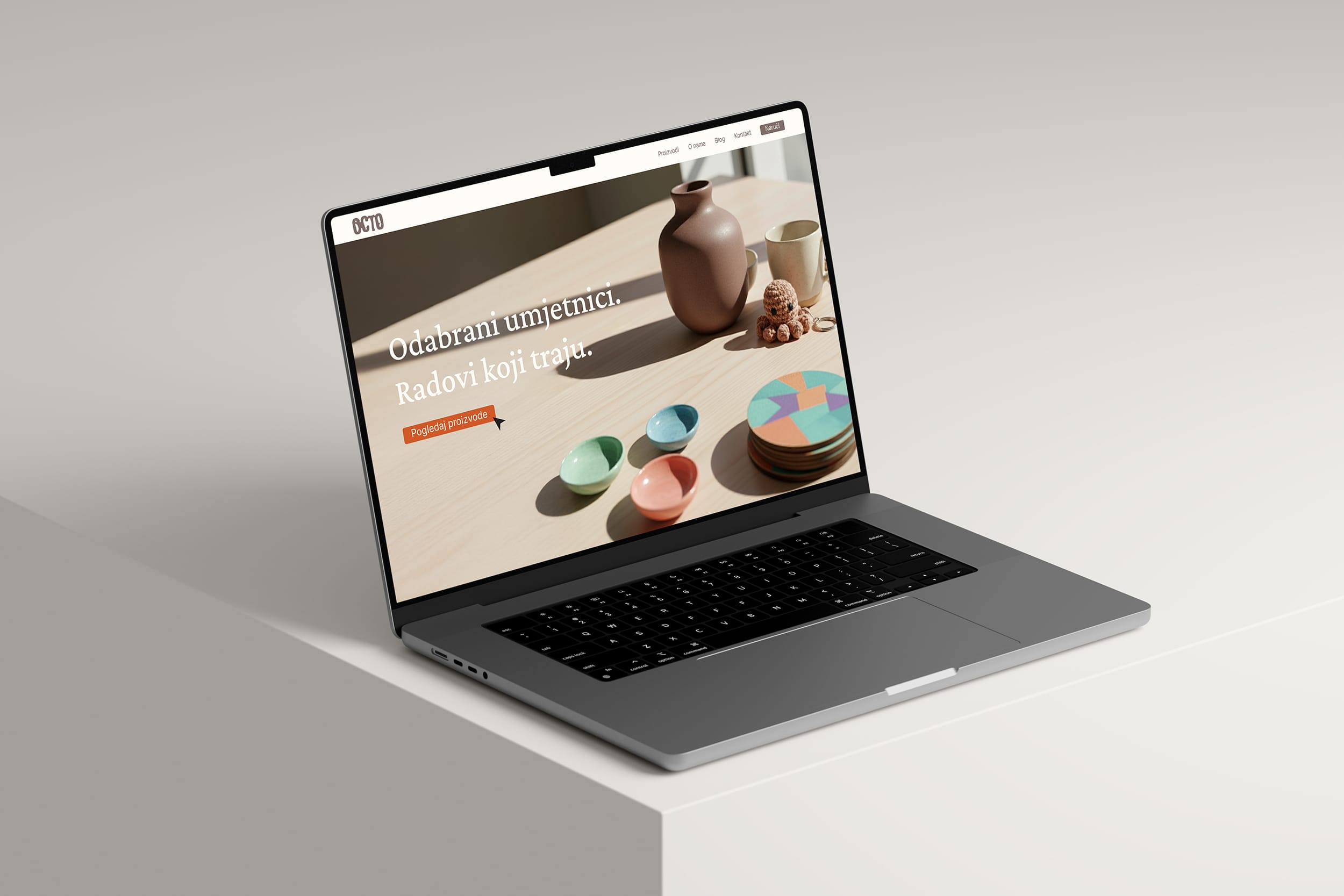
The logo is built from a rounded sans-serif typeface, further modified to create subtle shifts in width and shape. These variations form a fluid typographic system that visually mimics the octopus's movement and adaptability. Rather than a static mark, the logo works as a flexible element that can evolve across different applications. While many handmade brands rely exclusively on muted earthy tones, Octo introduces a more dynamic color system. Natural tones are combined with an unexpected terracotta accent that breaks the visual monotony often associated with craft aesthetics.
The result feels organic yet contemporary — signaling that handmade work can exist in a modern context too.
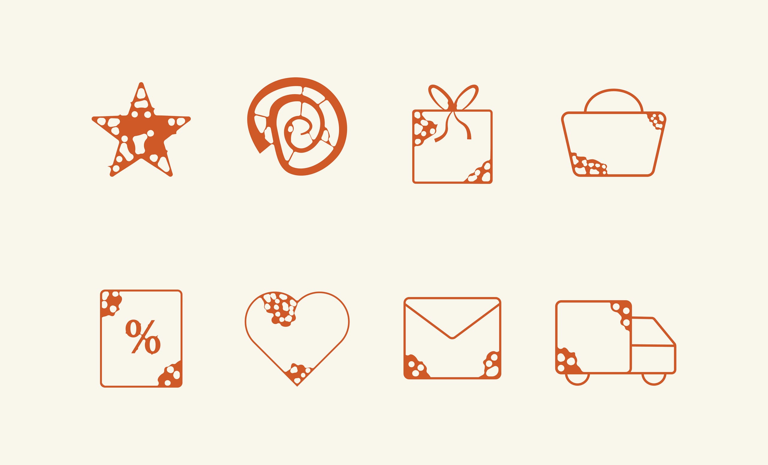
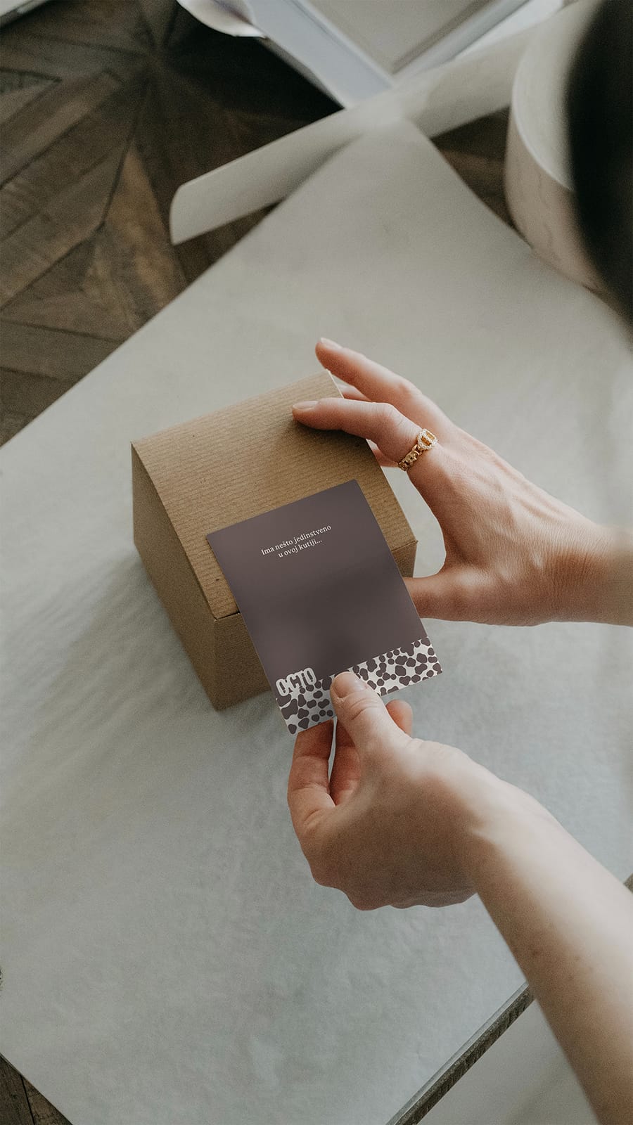
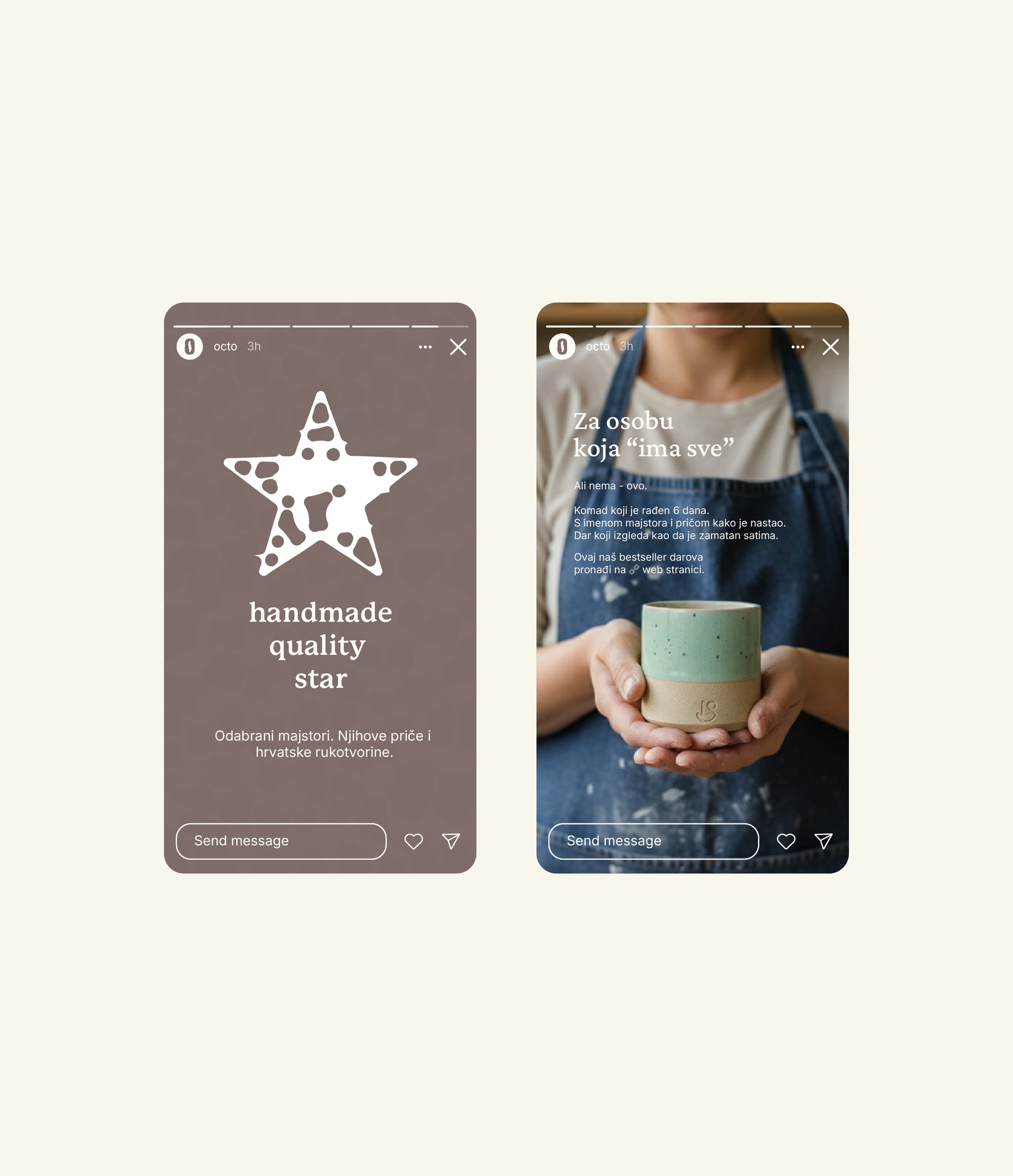
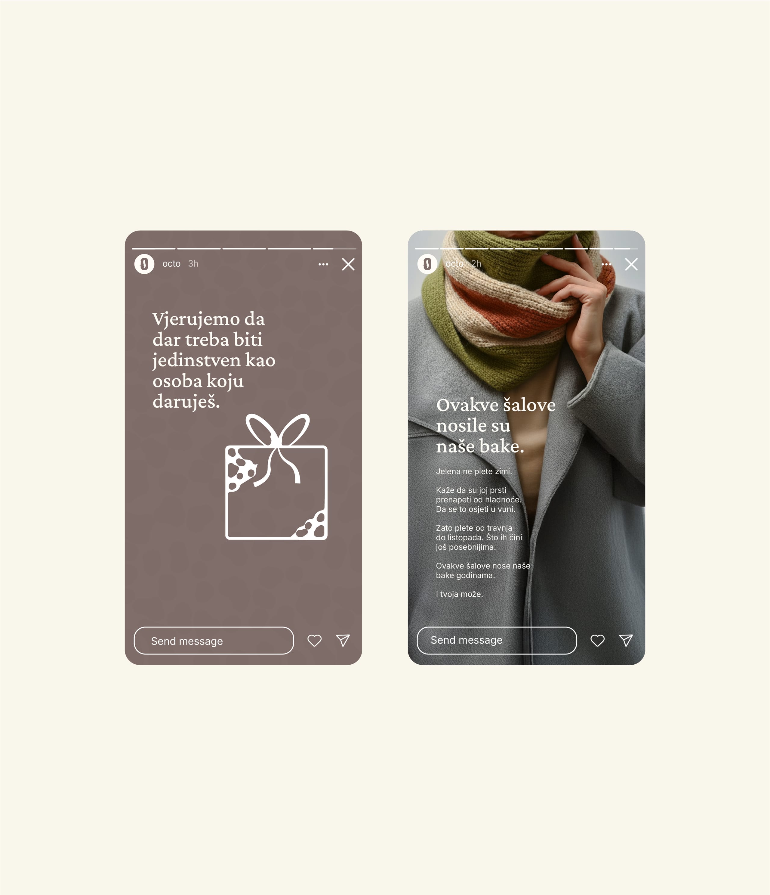
Organic shapes derived from the logo are used for patterns, UI icons, and supporting graphic elements.
Together, they form a flexible system that works across digital and physical applications without losing coherence. The identity allows Octo to communicate consistently while leaving enough room for future growth and collaborations with different makers.
A different way of presenting handmade work
The final identity positions Octo somewhere between a design platform and a marketplace. Products aren't presented as souvenirs or impulse buys, but as thoughtfully crafted objects made by real people. This shift changes the narrative: instead of focusing on transactions, the brand highlights the relationship between the maker, the object, and its recipient. Octo becomes a place where makers gain visibility and buyers discover objects with real meaning behind them.
This project reinforced something often overlooked in branding: playing it safe rarely earns visibility.
Had Octo followed the familiar visual language of handmade marketplaces, it would likely have blended into its surroundings. By challenging those conventions and building the identity around connection, fluidity, and contemporary craftsmanship, the brand gained a clear and recognizable position from the very start.
 visual identity logo design web design packaging design social media design graphic design visual identity logo design web design packaging design social media design graphic design visual identity logo design web design packaging design social media design graphic design visual identity logo design web design packaging design social media design graphic design visual identity logo design web design packaging design social media design graphic design visual identity logo design web design packaging design social media design graphic design visual identity logo design web design packaging design social media design
  Stories after they said ‘Sí’ Stories after they said ‘Sí’ Stories after they said ‘Sí’ Stories after they said ‘Sí’ Stories after they said ‘Sí’ Stories after they said ‘Sí’ Stories after they said ‘Sí’ Stories after they said ‘Sí’ Stories after they said ‘Sí’ Stories after they said ‘Sí’ Stories after they said ‘Sí’ Stories after they said ‘Sí’ Stories after they said ‘Sí’ Stories after they said ‘Sí’ Stories after they said ‘Sí’ Stories after they said ‘Sí’ Stories after they said ‘Sí’ Stories after they said ‘Sí’ Stories after they said ‘Sí’ Stories after they said ‘Sí’ Stories after they said ‘Sí’ Stories after they said ‘Sí’ Stories after they said ‘Sí’ Stories after they said ‘Sí’ Stories after they said ‘Sí’ Stories after they said ‘Sí’ Stories after they said ‘Sí’ Stories after they said ‘Sí’ Stories after they said ‘Sí’