
Inner Movement
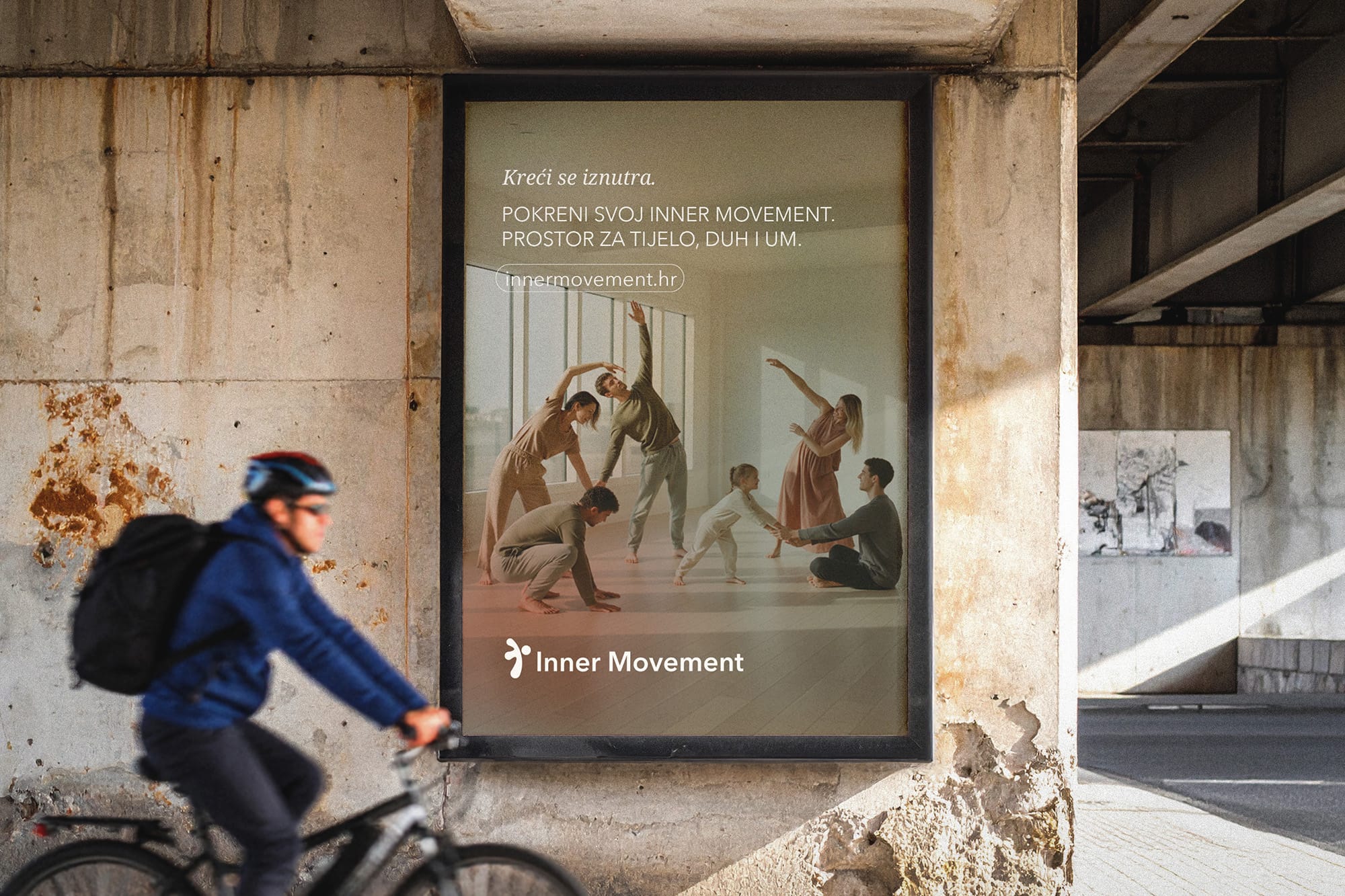
Movement as a practice of inner alignment
Inner Movement is a holistic wellbeing center that helps people achieve long-term balance of body, mind, and emotions through movement therapy, cognitive-behavioral training, and relaxation methods. The programs are designed for adults and children looking for more than physical activity – a space for personal growth, stability, and inner change.
Before the redesign, the visual identity couldn't convey that idea. The color palette had come together spontaneously, based on personal preferences, without a clear structure. The logo didn't adapt well to different formats, and the brand's communication wasn't building recognition. Although the center had a strong philosophy and a distinctive approach to working with clients, the visual system couldn't clearly communicate their value in the market. The goal of the project was to create an identity that conveys the feeling and purpose of the brand at first glance. Inner Movement didn't want to look like just another fitness or yoga studio. Their vision was to build a space that connects movement, mental growth, and emotional balance – and that very idea needed to become the foundation of the visual identity.
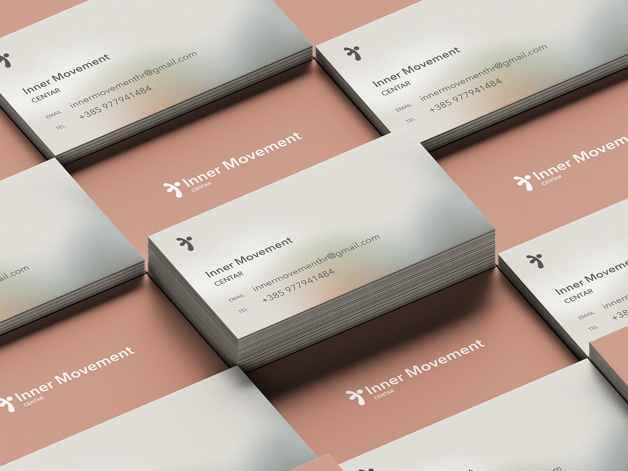
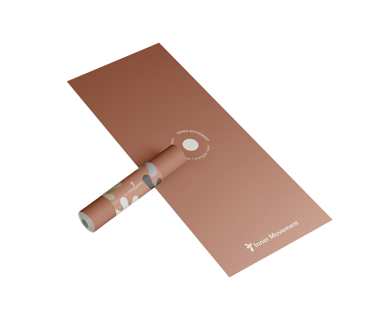
Inner Movement doesn't sell training.
Movement here is a tool for deeper transformation – the way people align body, mind, and emotions. The visual identity was developed around the idea of movement as a process of inner alignment. Instead of the classic fitness aesthetic that emphasizes performance and strength, the identity emphasizes energy, change, and personal growth. The visual system reflects that philosophy through a combination of structure and fluidity. The logo suggests a human form in motion, creating a clear link to the idea of transformation and personal growth. Flexible logo variants allow consistent application across different formats and communication channels. The color palette was developed to support the wide range of programs the center offers. A combination of warm and cool tones creates a sense of balance between energy and calm. Gradients and textural elements introduce a feeling of depth and change – a visual reflection of the process of personal transformation.
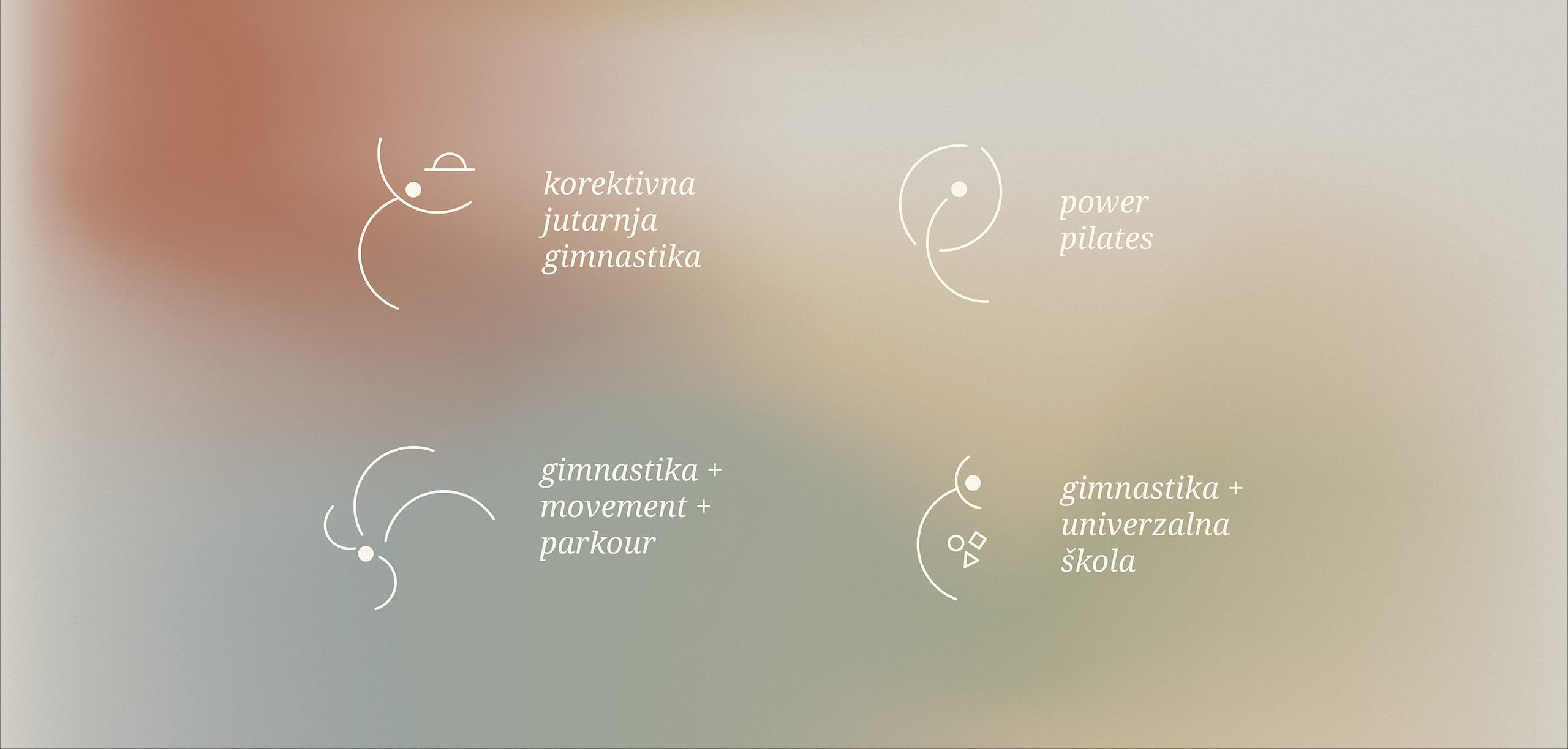
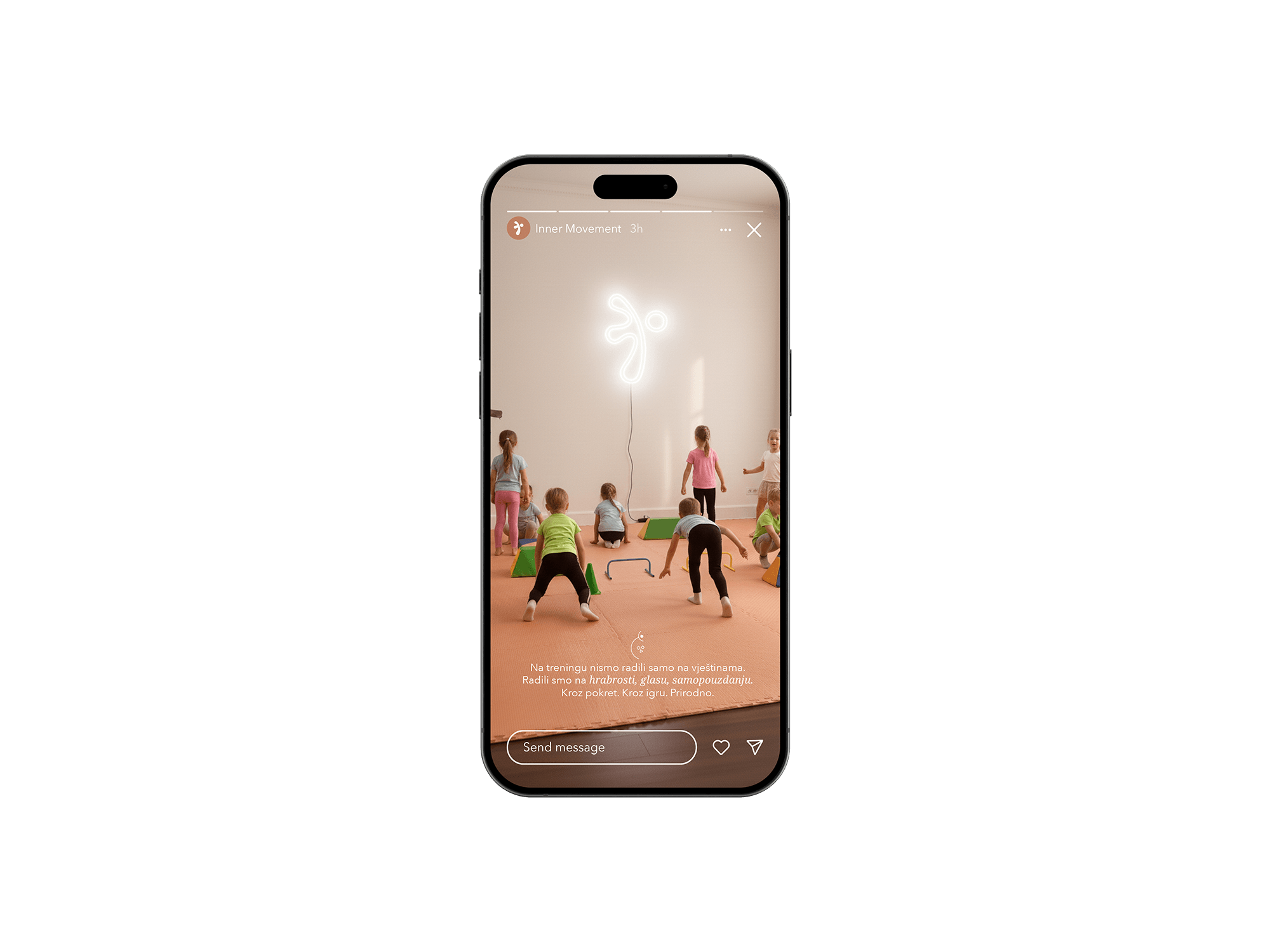
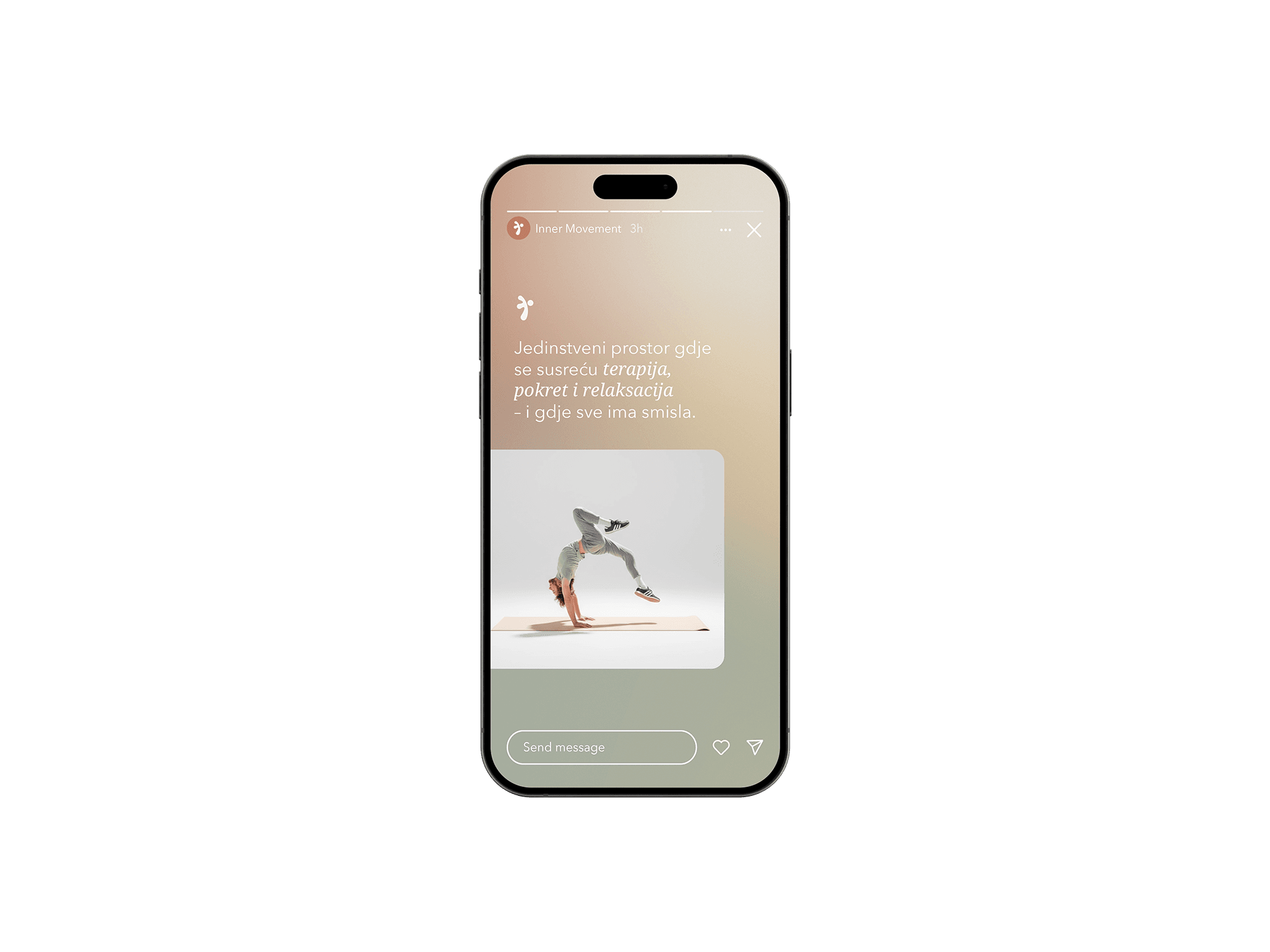
To make the communication of the programs clear and intuitive, a system of illustration elements derived from the logo was developed. These visual markers make it easy to quickly recognize the center's different activities on social media, the web, and printed materials. The identity was developed as a flexible system that works across different communication channels.
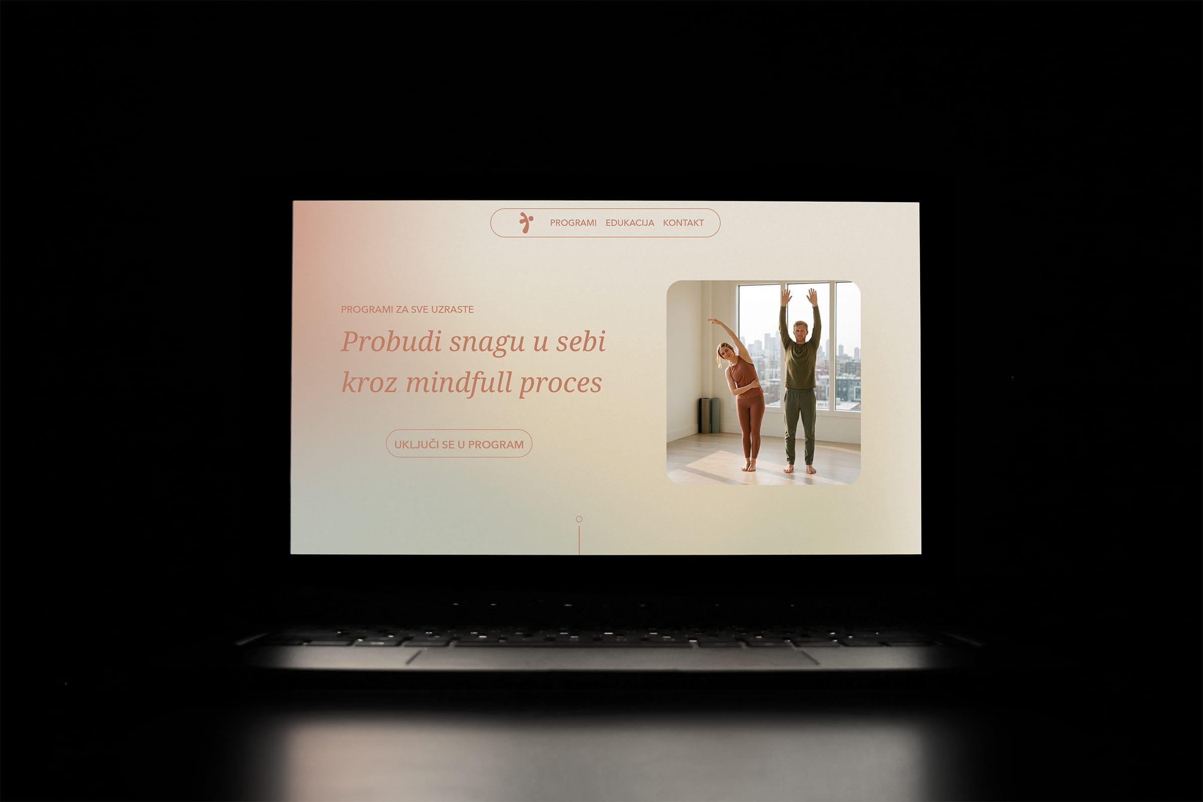
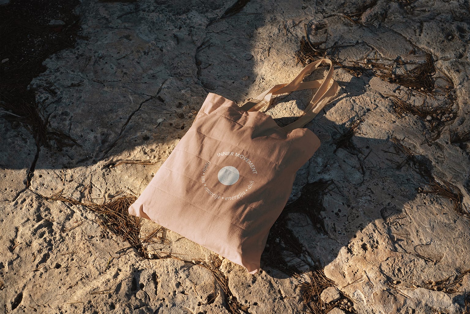
The visual elements are used on social media, the website, and printed materials, creating a consistent visual language that allows clear communication of the different programs within the center.
The result is an identity that gives Inner Movement clarity, structure, and recognition. Instead of constantly experimenting with visuals, the team now has a system that enables consistent communication across different programs and channels. The brand gained a visual language that reflects its philosophy and clearly positions it outside the typical fitness and wellness aesthetic. Today, Inner Movement communicates its idea from the very first encounter – movement as a path to inner balance.

 visual identity logo design web design packaging design social media design graphic design visual identity logo design web design packaging design social media design graphic design visual identity logo design web design packaging design social media design graphic design visual identity logo design web design packaging design social media design graphic design visual identity logo design web design packaging design social media design graphic design visual identity logo design web design packaging design social media design graphic design visual identity logo design web design packaging design social media design
  Stories after they said ‘Sí’ Stories after they said ‘Sí’ Stories after they said ‘Sí’ Stories after they said ‘Sí’ Stories after they said ‘Sí’ Stories after they said ‘Sí’ Stories after they said ‘Sí’ Stories after they said ‘Sí’ Stories after they said ‘Sí’ Stories after they said ‘Sí’ Stories after they said ‘Sí’ Stories after they said ‘Sí’ Stories after they said ‘Sí’ Stories after they said ‘Sí’ Stories after they said ‘Sí’ Stories after they said ‘Sí’ Stories after they said ‘Sí’ Stories after they said ‘Sí’ Stories after they said ‘Sí’ Stories after they said ‘Sí’ Stories after they said ‘Sí’ Stories after they said ‘Sí’ Stories after they said ‘Sí’ Stories after they said ‘Sí’ Stories after they said ‘Sí’ Stories after they said ‘Sí’ Stories after they said ‘Sí’ Stories after they said ‘Sí’ Stories after they said ‘Sí’