
Accuris
Where accounting meets partnership
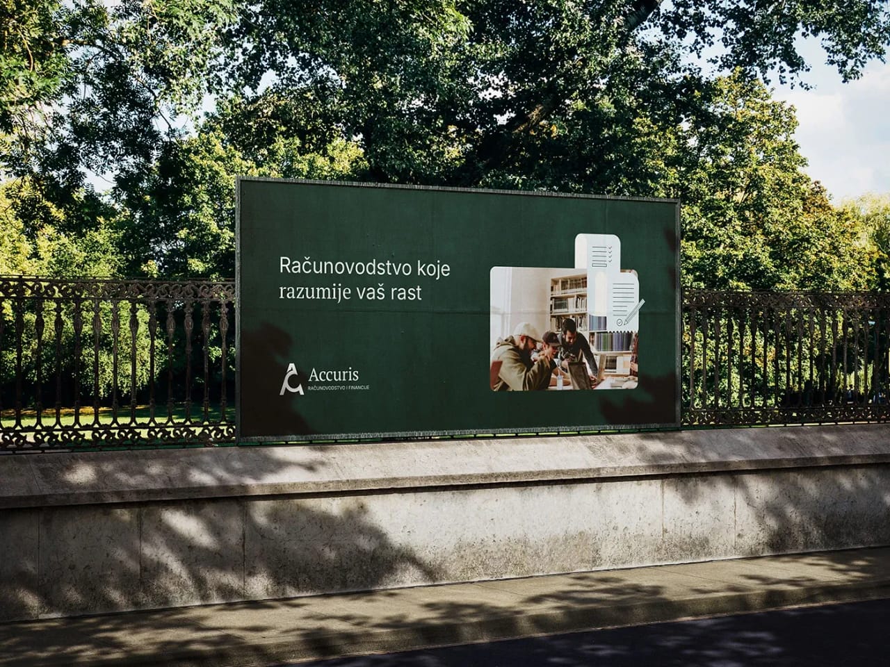
Accuris isn't just another accounting firm. It was born from a desire to give entrepreneurs a true partnership, clarity in their finances, and support in strategic planning. My job was to translate that philosophy into the visual identity — to create a brand that looks professional and reliable, but also approachable and friendly, with a touch of warmth. From the very first glance, Ivan and I wanted his business to leave an impression of youthful spirit — seriousness with a dose of ease — showing that at Accuris, accounting isn't seen as outdated, but as ready to face any change in business.
The goal wasn't to create the cold, generic look that so often follows the financial sector. On the contrary, I wanted Accuris to look modern, precise, but human. Every visual element, from the logo to the icons and illustrations, is designed to communicate stability, clarity, and an analytical mindset, while still leaving room for the human dimension of business.
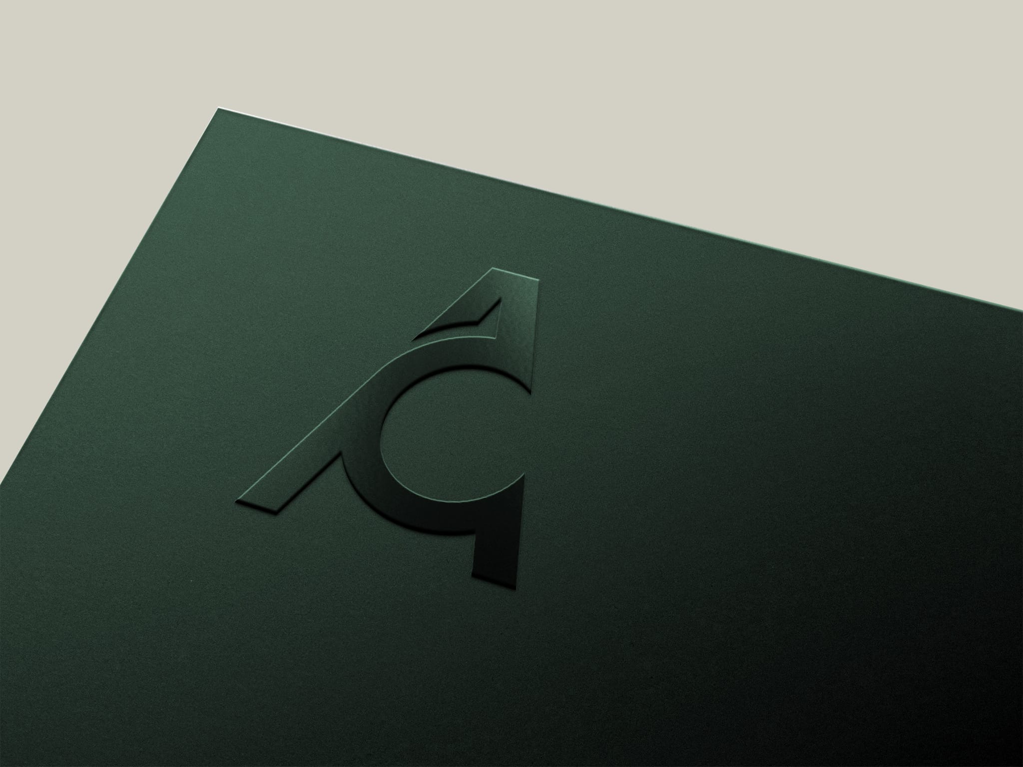
A lot of meaning in a single letter.
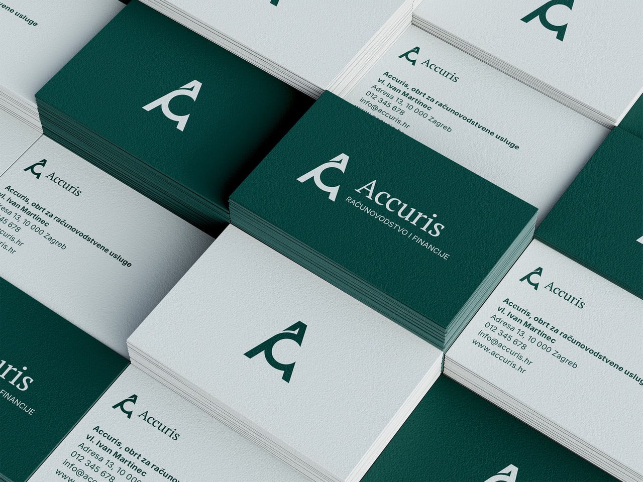
The logo is the heart of the identity. Joining the letters A and C created a modern, dynamic symbol. The A symbolizes growth, forward direction, and financial rise, while the C brings a sense of openness and collaboration. It's not just a mark — it's a visual reminder of the partnership and approachability Accuris brings to its clients.
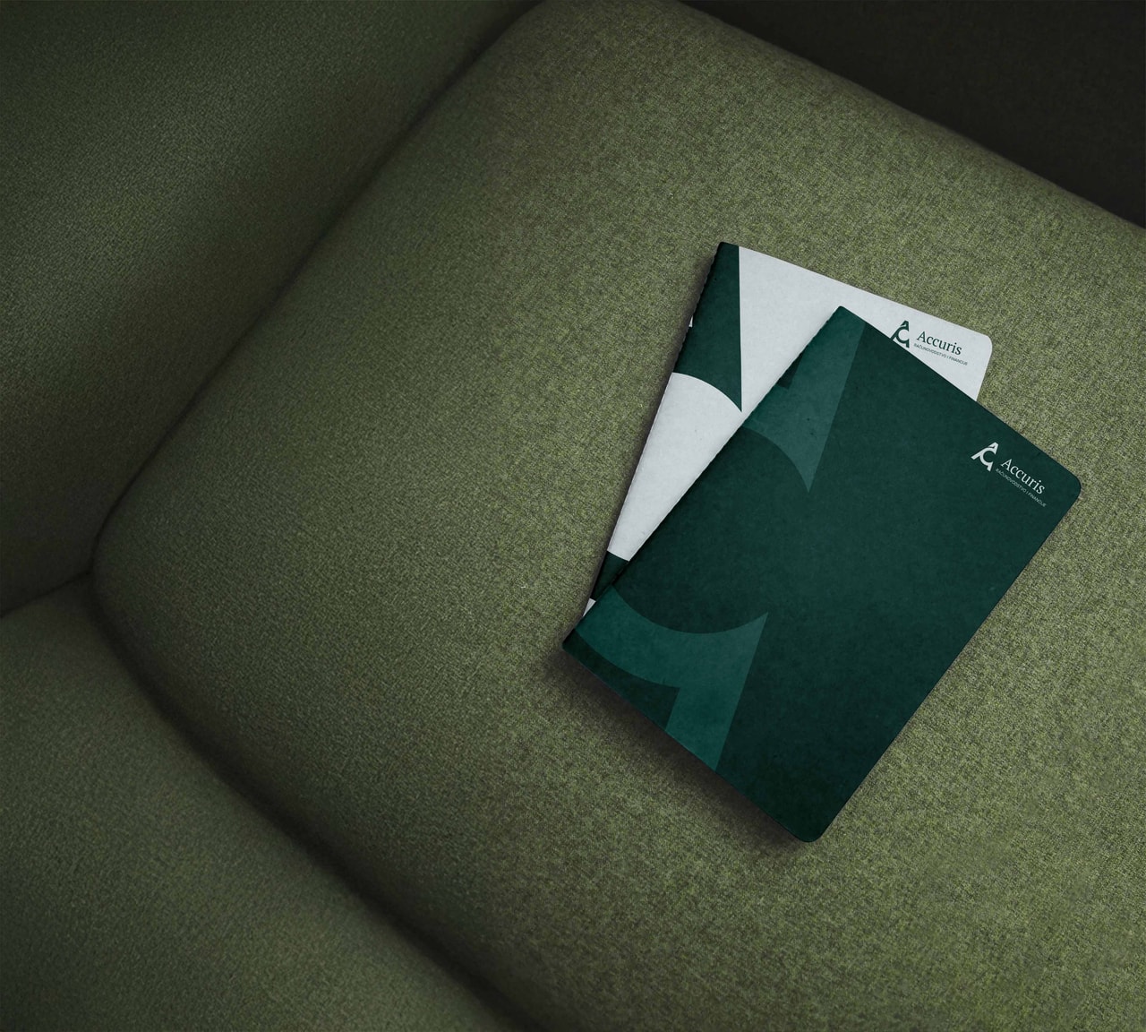
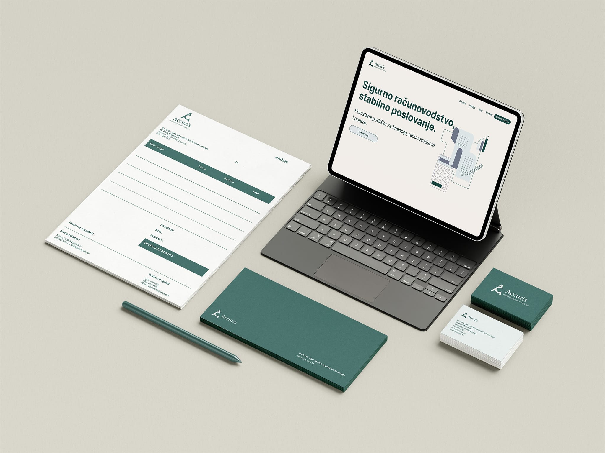
The color palette was chosen to reflect stability and trust: dark green for seriousness and reliability, soft blue tones for freshness and approachability. The typography is precise and modern, emphasizing expertise as well as clarity in communication.
To differentiate even further from the competition, we needed to add elements that aren't common in the sector — and the illustration set was dedicated to exactly that. The illustrations and icons, designed exclusively for Accuris, are used on the website and are meant to extend across social media, flyers, posters, tote bags, and all promotional graphic materials.
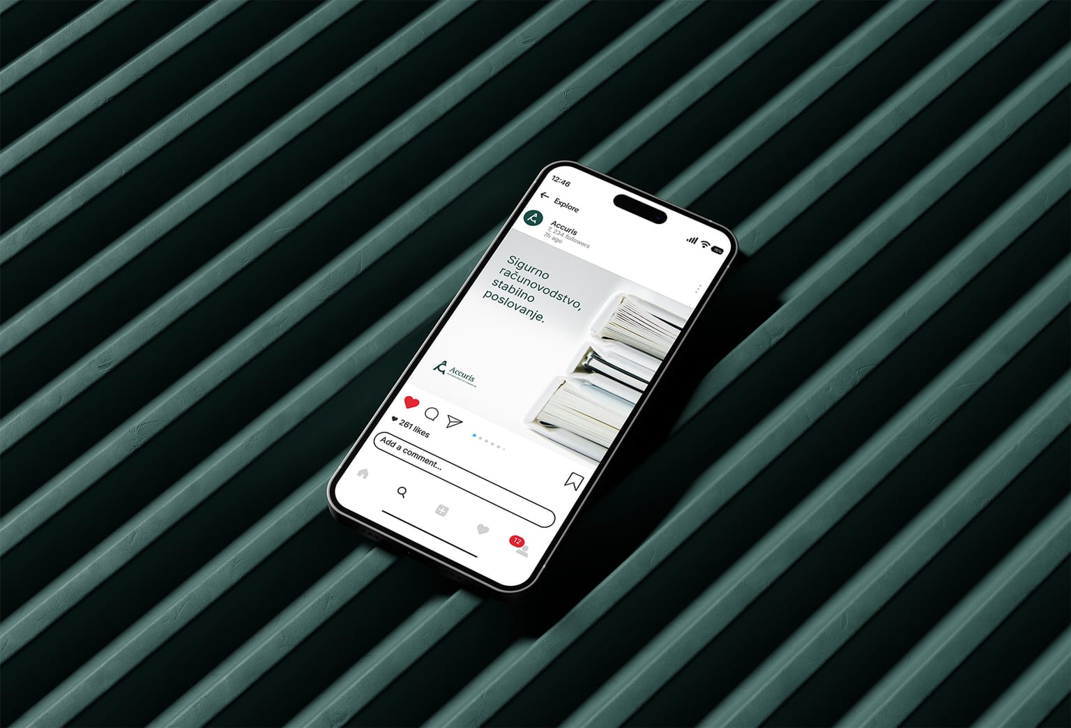
Accuris's visual identity now lives every day across digital and print media, through illustrations and icons that complement photography — and every brand touchpoint tells the same story: finances can be professional, structured, and precise, yet friendly and approachable.





 visual identity logo design web design packaging design social media design graphic design visual identity logo design web design packaging design social media design graphic design visual identity logo design web design packaging design social media design graphic design visual identity logo design web design packaging design social media design graphic design visual identity logo design web design packaging design social media design graphic design visual identity logo design web design packaging design social media design graphic design visual identity logo design web design packaging design social media design
  Stories after they said ‘Sí’ Stories after they said ‘Sí’ Stories after they said ‘Sí’ Stories after they said ‘Sí’ Stories after they said ‘Sí’ Stories after they said ‘Sí’ Stories after they said ‘Sí’ Stories after they said ‘Sí’ Stories after they said ‘Sí’ Stories after they said ‘Sí’ Stories after they said ‘Sí’ Stories after they said ‘Sí’ Stories after they said ‘Sí’ Stories after they said ‘Sí’ Stories after they said ‘Sí’ Stories after they said ‘Sí’ Stories after they said ‘Sí’ Stories after they said ‘Sí’ Stories after they said ‘Sí’ Stories after they said ‘Sí’ Stories after they said ‘Sí’ Stories after they said ‘Sí’ Stories after they said ‘Sí’ Stories after they said ‘Sí’ Stories after they said ‘Sí’ Stories after they said ‘Sí’ Stories after they said ‘Sí’ Stories after they said ‘Sí’ Stories after they said ‘Sí’